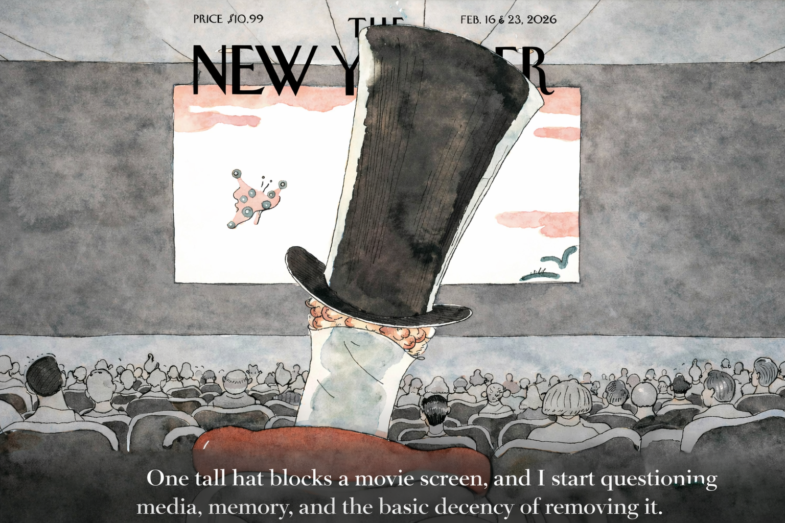
The Man in the Hat
W…ritten by
jaron summers © 2026
I picked up the February cover of The New Yorker and immediately thought:
The Mad Hatter.
Then I thought:
Is that a backward homage to a certain president?
Then I thought:
The least he could do is remove his hat.
That was my first honest reaction. Not symbolic appreciation. Not intellectual admiration. Annoyance.
The man — if it is a man — is seated in front of me. His tall hat blocks my view of the screen. I am trying to watch a movie. He is ruining it.
Common manners in a theater, as I was raised to understand them, require the removal of hats.
Instead, there he sits, rigid, elevated, silhouette sharp enough that the top of the hat looks like the head of an axe. An axe, mind you. The kind that splits things.
Now here is where the problem begins.
Was that intentional?
Or is my mind beginning to invent meaning where none exists?
Five People on Earth
My first suspicious thought was this:
Surely five people understand this cover instantly.
And they probably all work for the magazine.
I imagined a small conference room in Manhattan where someone says, “It’s obviously about fragmented media consumption and institutional longevity,” and everyone nods gravely.
Meanwhile, I am standing in my kitchen holding the magazine and thinking:
Take off your hat.
There is something humiliating about feeling outside a joke.
You begin to wonder if the joke is sophisticated and you are not. Or worse — if you once would have understood it immediately and now you don’t.
That’s when the darker thought crept in:
Is this how it starts?
Is this what cognitive decline feels like?
Not forgetting your address.
Not wandering into traffic.
Just standing there thinking,
Why does that hat look like an axe?
The Esquire Ghost
The image also reminded me of the old Esquire mascot — that urbane floating head with the knowing mustache.
Why did my mind go there?
Because icons rhyme.
Early 20th-century dandies all carry the same genetic material: formality, irony, cultivated taste. They are symbols of a world that believed in posture.
But when you place such a figure between me and a movie screen, something shifts.
He is no longer elegance.
He is obstruction.
The Geometry of Irritation
After some thought — and a bit of technical dissection — the mystery thinned.
Covers are designed to work at a distance. Before you see detail, you see shape. A tall hat creates a vertical spike in a horizontal frame. It dominates.
Put that shape in the foreground and the viewer becomes seated behind it.
I am not observing the scene.
I am in it.
And I am mildly irritated.
Which means the design is working.
It is not about streaming versus cinema.
It is not about monocles.
It is not about coded messages understood by five elite interpreters.
It is about perspective.
The man is blocking my view because I have been placed in the row behind him.
That is deliberate staging.
Suspicion and Sanity
The more interesting part was not the cover.
It was my reaction to my reaction.
The suspicion that I was missing something obvious.
The flicker of self-doubt.
That flicker is not decay.
It is standards.
When you’ve spent a lifetime paying attention — to words, to images, to subtext — you assume there must be one.
Sometimes there isn’t a secret.
Sometimes there is just composition.
When I moved from fog to clarity, that was not decline.
That was analysis doing its job.
The Hat Remains
After all that, the man still should remove his hat.
But now I understand that my irritation was part of the design.
The cover is not mysterious anymore.
It is constructed.
And that may be the most reassuring thing of all.
The world is complicated.
But this particular hat?
It’s just geometry.
Final thought: In the old days, a gentleman removed his hat so everyone could see the picture. Today, he keeps it on — and calls that the show.