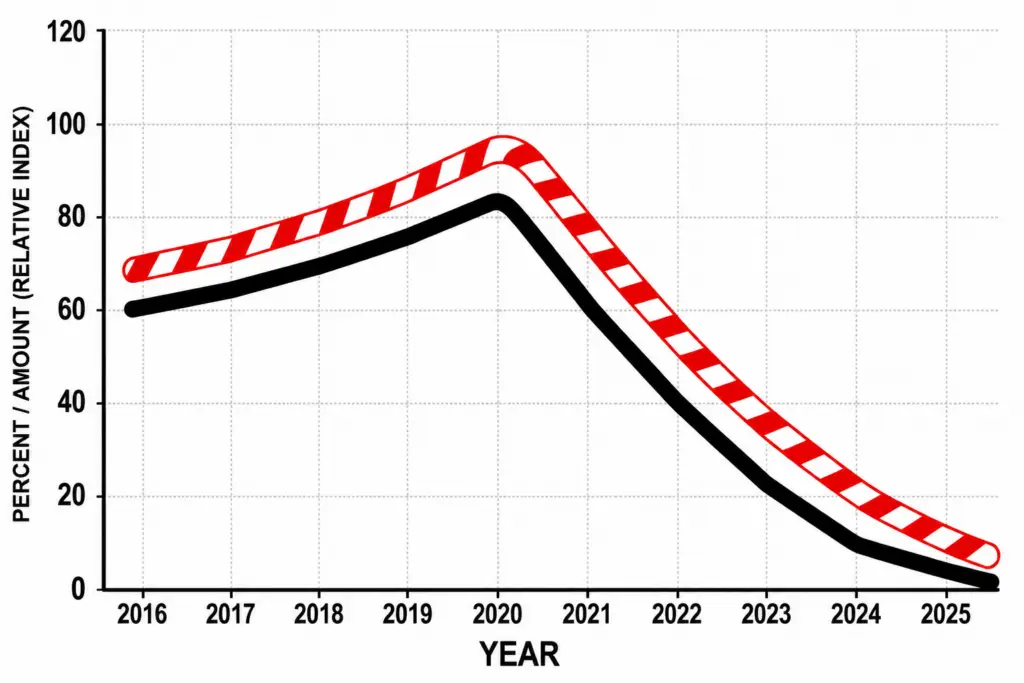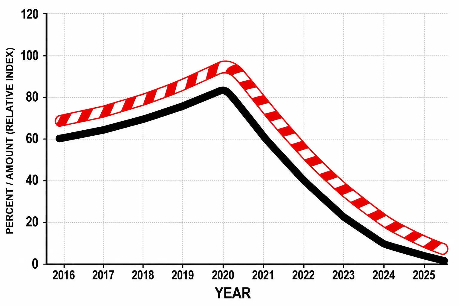

A curious graph recently surfaced online after it was allegedly discovered near Temple Square in Salt Lake City.
It had no title, no labels, and no explanation.
Just two dramatic lines plunging toward the basement of civilization.
One line is thick and black.
The other is red and white, like a candy cane that has just read the Book of Revelation.
Attached to the chart, according to absolutely no reliable source whatsoever, were several faded Post-it notes. One said:
“Major crisis begins around 2020. Do not show this to anyone named D—”
Another appeared to say:
“If asked, blame the youth program.”
Naturally, the internet has been trying to figure out what the two lines represent.
Theories So Far
Some believe the black line shows the decline in church casseroles containing actual vegetables.
Others say it tracks the number of young men who still know how to tie a necktie without watching a YouTube tutorial.
One retired accountant from Provo insists it represents the annual production of funeral potatoes per capita.
A former seminary student claims the candy-cane line measures how often someone says, “I know this meeting is running long,” before making it run longer.
Another theory suggests the candy-cane line tracks the amount of chocolate consumed in Utah, which allegedly collapsed after 2020 when thousands of people suddenly discovered coffee, kombucha, and emotional honesty.
Someone else suggested the black line measures “unexplained disappearances from youth dances immediately after the slow song begins.”
A man in Ogden believes both lines represent the spiritual condition of ward bulletin boards.
A woman in Draper says the red-and-white curve clearly tracks the decline of peppermint bark after Christmas, while the black line shows hope.
Several people have suggested the graph has something to do with dating, temptation, virtue, chocolate, guilt, and the mysterious power of a coed with a lip gloss budget.
We cannot confirm this.
We cannot deny it either.
Mostly because we made the graph up.
The Historical Angle
Some amateur historians have pointed out that a church once famous for complicated family arrangements might naturally be interested in mysterious lines involving romance, appetite, restraint, and sudden social collapse.
Others argue that this is unfair.
They say the graph could just as easily represent the number of bishops who have successfully understood TikTok.
That number also appears to be approaching zero.
A Plea to the Public
So we ask:
Does anyone know what these lines mean?
Were you there?
Did you see the Post-it notes?
Did your uncle once work in a basement office where graphs were printed, shredded, prayed over, and then accidentally recycled?
If so, please come forward.
Your identity will be protected, unless your theory is really funny, in which case we may name a casserole after you.
Final Confession
All right. Fine.
I made up the statistics.
I made up the graph.
I made up the alleged discovery.
But I did not make up the fact that a candy-cane line plunging off a chart looks deeply suspicious.
And somewhere in Salt Lake City, I like to imagine, there is a committee still trying to explain it.
I’m going to have some more fun.
👉 Watch JERKY MAN.